Wakemodell-Validierungstests (Englisch)
Zur deutschen Hauptseite | Alle deutschsprachigen Seiten
Test of calculated wake loss on varying wind farm sizes
A good way to compare wake models (verification) is to see how the calculated wake loss changes by wind farm size. Here we show a calculation setup, with a square layout with 7 RD spacing based on a large WTG, the Vestas 8 MW V164 with 100m hub height offshore. Then from 3 x 3 up to 31 x 31 rows (961 WTGs) are tested. This will reveal how the different models compare.
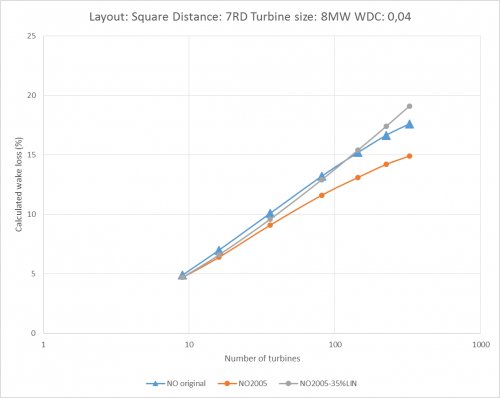
The development of calculated wake loss by wind farm size. NO2005 test.
Using a logarithmic x-axis, the calculated wake loss increases almost linearly with wind farm size when spacing is kept constant.
For small wind farms (< 20 turbines), the three variants calculate almost identical results. The deviations increase as project size increases.
By the time the project reaches 100 turbines, the NO2005 calculates around 2% more AEP than the original N.O. Jensen model. At 250 turbines, this increases to 3%, showing some issues with this model variant for large wind farms.
Using a linear weight of 35% in the NO2005 combination model, brings the result closer to the original N.O. Jensen model and AEP deviations are less than +/- 1%. Mirror wake is used in NO2005 in the figure above.
Extended test including PARK2, WakeBlaster and Ainslie DAC
In earlier windPRO versions (< 3.0) the NO2005 was the only wake model for time step calculations. Now multiple wake models can be used for time step calculations.
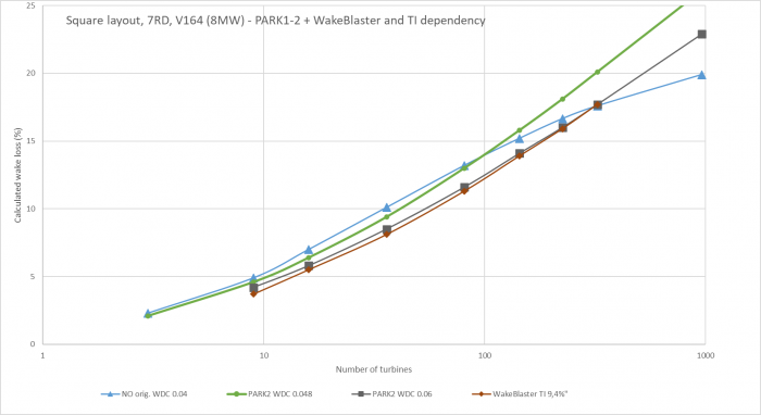
Park 1&2 and WakeBlaster test by wind farm size.
Increasing wind farm size from 3 to 961 WTGs and calculating wake losses for the same layout, is illustrated above for the N.O. Jensen variants + WakeBlaster. A very good agreement is seen. The impact of the WDC choice is seen for PARK2, where the WDC 0.06 (DTU recommendation for offshore) is compared to the lower 0.048 (low TI site). The low TI site shows around 1 percentage point higher calculated wake losses for medium size and 2-3 percentage points higher wake losses for large wind farm sizes. The original N.O. Jensen (PARK1) does have a slight “saturation” with very large wind farm sizes. This has been seen as a problem, which did require some deep array correction for very large wind farms, e.g., the Zafarana wind park in Egypt with 700 WTGs, but this is also seen at e.g., Horns Rev area, where PARK2 handles the wake loss calculation better than PARK1. PARK2 and WakeBlaster almost fully agree in the test. Here WakeBlaster is run with slightly higher TI which explains why it calculates slightly lower wake loss than PARK2.
PARK1&2 almost agree for up to 100 WTGs, which is good as PARK1 has been the most used and recognized wake model in the most recent 30+ years.
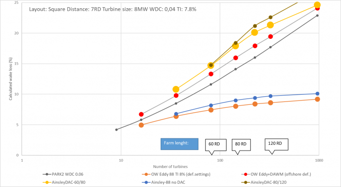
Ainslie in Open Wind and windPRO test by wind farm size.
Above, the new windPRO Ainslie 1988 and DAC implementation is compared to Openwind from UL similar models. This leaves no doubt that the Ainslie as a “stand alone” won’t work, even just for 6 x 6 row wind farm; it needs a deep array correction model.
The windPRO and Openwind implementations agree well, although a little higher wake loss is calculated by windPRO. However, there are many parameter options both in windPRO and in Openwind, so the differences are just a matter of default choices. Later validation examples for Horns Rev wind farms and other show that the higher calculated wake loss by Ainslie 1988 is related to the large WTG size (8MW) used in this example. For smaller turbines 2-3 MW, there are better agreements also with PARK2.
For the very large wind farms, the recovery zone settings make a difference in the windPRO Ainslie 1988 implementation. In the chart above there are two series of Ainslie with DAC using different recovery zone settings: “Ainslie DAC-60/80” and “Ainslie DAC-80/120”. It can be observed that the flattening of wake losses as the wind farm size increases gets delayed when increasing the recovery zone from 60/80 RD to 80/120 RD. Where and if this flattening of wake loss shall occur, no recommendations are given.
Some of the tests presented in this chapter will illustrate how the deep array settings perform. This manual chapter concludes that deep array effects are actually more a question of using the correct turbulence. But still, for tuning wake models for post construction evaluations, the so-called deep array effects still can be relevant. Especially if using the Ainslie model as a “stand alone” there is a high underestimation of the wake reductions in the “deep” arrays.
Single row versus multiple row wind farms
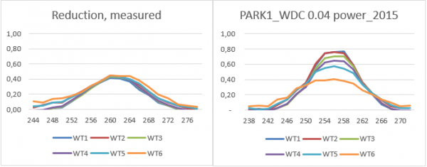
A special problem to pay attention to is the single row vs multiple row projects. For single row projects, the wake models tend to estimate too high wake losses for backrow turbines. The simple explanation is that undisturbed wind is fed in from the sides along the row, reducing the actual wake loss. In actuality, it is typically seen that the backrow turbines have similar losses to the second-row turbines, while the wake models instead increase the wake losses with the number of upwind turbines. An example is illustrated below:
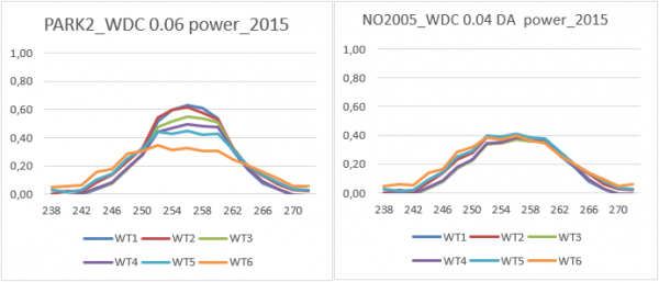
Measured left, calculated reductions by PARK1 (org. N.O.Jensen) right.
WTG 6 is the upwind turbine, with just 1 wake turbine in front (WTG7). X-axis shows direction (degrees). Note the measurements show almost the same reductions (Power%) for all six wake-affected turbines.
Calculations show essentially larger decrease in centre angles and by a number of upwind turbines.
Calculated reductions by PARK2 left and by NO2005 with DA
With PARK2 it looks better, but the only real way to solve the single row calculation problem in this example is to increase WDC by number of upwind turbines using the deep array settings in NO2005.
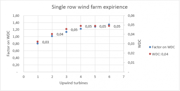
In the calibrated version above to the right, the WDC change by upwind turbines are set as follows:
This result in following:
Factor on WDC and thereby increased WDC number of upwind turbines.
As seen, the WDC with “base” set to 0.04 will convert to 0.03 for the first wake turbine, gradually increasing to 0.5, which is the upper limit after four upwind turbines. This work for single row projects (offshore for the mentioned values), where numerous other single row projects have been tested.
Horns Rev area, Danish Offshore project
The Horns Rev area at the Danish West coast is a good test case as there are three large offshore projects with many operational years for the first two areas and with large 8 MW turbines for the last project, HR3. This makes it possible to test for long-term operation, wind farm area interaction and large turbines.
Verification for Horns Rev area, wind statistic based, new Ainslie DAC focus
For the statistical based calculations, the focus is on comparing models (verification), not validation.
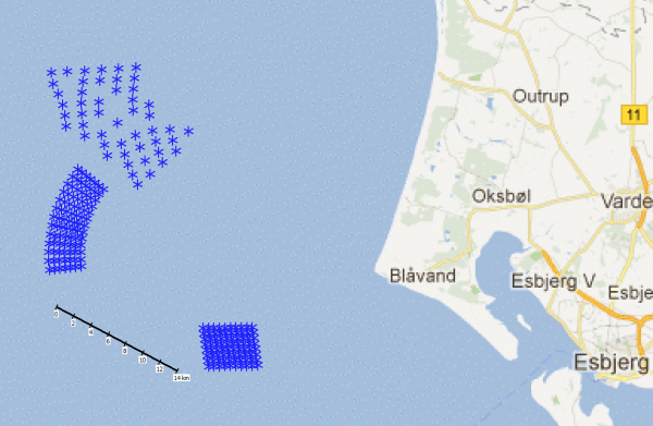
Map of Horns Rev area, HR1 south, HR2 mid and HR3 north.
At Horns Rev there are three wind farms making this area suitable for testing single wind farm calculations with different turbine sizes and different layout configurations.
The Turbulence Intensity (TI) in this area is around 7.5%, which is relatively high for an offshore site. The TI at the site is found from multiple measurement masts in the area combined with mesoscale data and is valid for the wind speed interval of 5-15 m/s. This is the wind speed interval where wakes dominate.
Several validations show that PARK2 handles this site very well with the DTU default Wake Decay Constant, WDC = 0.06. This corresponds to the EMD recommendations to use WDC = 0.8 x TI for offshore sites. (0.8 x 7.5% = 0.06)
For the Ainslie model, where TI is the main input parameter, this is set to 7.5% in the following calculations. The Deep Array Correction model (DAC) has more parameters as shown in Section 3.7.1.2 The Ainslie/DAC implementation. The added roughness for offshore areas is by default 0.02, used in the tests along with 0.01, to illustrate the sensitivity of the parameter.
The below figures show calculated wake losses with long term (20y) mesoscale model data for the area using the EMD-WRF Europe+ dataset. This is found to reproduce the wind speeds seen very precisely for this area.
For comparison, the Openwind Eddy Viscosity model (Ainslie) and PARK2 model are calculated. While we do not believe the formula revisions for PARK2 compared to PARK1 has been made in Openwind, the N.O. Jensen model can run with linear combination model and excluding mirror wakes, which is close to PARK2. And then the Ainslie with DAC is run with default settings for offshore. For full disclosure, there are several tuning parameters in Openwind that have not been tested here.
Calculating HR1 and HR2 as “stand alone” and combined
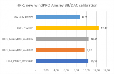
Plots showing calculated long-term wake losses for different combinations.
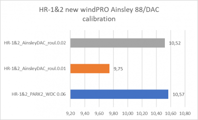
The new windPRO Ainslie 1988 with DAC default settings, returns almost exactly the same wake loss as windPRO PARK2 (N.O. Jensen) for HR1 alone, HR2 alone and when both windfarms are calculated together.
It can be seen how sensitive the DAC model is to the roughness increase by testing 0.01 as alternative to the default 0.02. The result shows a decrease in calculated wake loss of just under 1 percentage point.
The Openwind calculations show some higher calculated wake loss with their PARK2 model and a little lower with Ainslie-DAC.
Which one of the windPRO Ainslie-DAC or PARK2 models performs best is not possible to say based on the real operational data, as the difference is too small to detect. However, based on detailed tests with 10-min operational data, we know that the size order of the calculation results for windPRO PARK2 are very accurate.
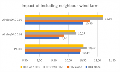
Impact of neighbour wind farm in calculations.
Looking at the impact by inclusion of another wind farm 15 km away, the impact is relatively small. The biggest impact shall be expected on HR1 from HR2 due to the wind direction distribution. This is also demonstrated with PARK2, but only by 0.2 percentage points. This is as expected, because when looking at the data for HR1 before and after commissioning of HR2 there is practically no difference to see. Ainslie DAC has a higher increased wake loss, although also small.
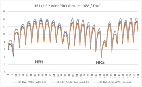
Turbine by turbine calculated wake loss.
In the graph above, there are three calculation variants with calculated wake losses WTG by WTG. The first 80 WTGs are HR1, the next 91 are HR2. There are small differences, but quite small and very similar patterns with PARK2 and Ainslie DAC with defaults.
Conclusion for HR1&2: The windPRO Ainslie-DAC (1988) performs almost as PARK2 with default settings – and PARK2 has been validated in several studies to perform very accurately for these wind farms.
3.9.3.1.2 Calculating HR2 and HR3 as “stand alone” and combined
In this example, there is an added challenge compared to HR 1&2, with HR3 having significantly larger turbines, RD 164 against HR2’s 93 m. And the two wind farms are located much closer together.
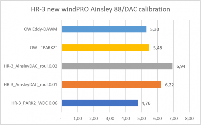
Calculated wake losses for HR3 with 8 MW WTGs.
Above, when calculating HR3 with much larger WTGs, there are much larger deviations. Ainslie-DAC with default settings calculates ~2 percentage points more wake loss than PARK2. Even with a lower increase of roughness, it calculates 1.5 percentage points more wake loss than PARK2. In this case, Openwind PARK2 and windPRO PARK2 are in better agreement and the two different models get more similar results than with the smaller wind turbines.
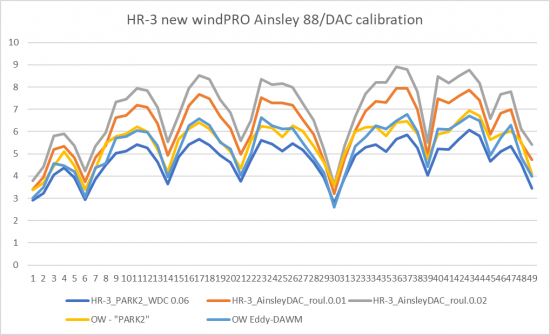
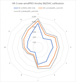
Details on wake loss calculation for HR3.
The figure above shows how deviations are seen for all turbines and directions. Here, it is hard to tell what is correct as HR3 has not been operating without HR2 impact. Combining with HR2 we might get an idea.
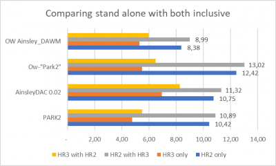
HR2 & 3 wake loss calculation with different combinations.
Here is seen how much impact the different models calculate by including the neighbor wind farm.
Especially interesting is the increase in calculated wake loss for HR2 by the presence of HR3 as this might be detected in the operation data. Albeit, difficult due to market regulation and operational issues.
All model variants agree well on the impact of including the neighbor wind farm.
Conclusion for HR2&3: There are differences in PARK2 and Ainslie/DAC in calculated wake loss when the turbine size gets larger, here 8 MW, where Ainslie/DAC calculates higher wake losses. This might lead to revised default recommendations for either one or both models when the turbines are larger, but it is too difficult to say based on a single example. All models agree on the size order of increased wakes from the neighbor wind farm.
Tests for Horns Rev area, time step based.
First, a detailed validation of both the mesoscale data and the wake loss calculation setup is made based on HR1. This detailed validation is possible due to access to 10-min data. Next all models are tested on all three wind farms in the HR area based on monthly measured production data.
For the monthly data it is worth keeping in mind where these are measured. In Denmark, and assumed similar in the UK, the monthly data is measured at the low voltage side at the substation. This means that the measurements are reduced with 1.5 – 2% electrical losses (step up transformer and internal grid each account for typical 0.7-1%). In addition, internal consumption during stops can add 0.1-0.2% by reasonable normal operation. For sites with heavy market regulation shut down, this can be significantly higher.
Using the 10-min SCADA data, this is typically measured after the step-up transformer, which includes approx. 1% loss. Thus, applying a ratio of 0.99 measured/calculated for all normal 10-min SCADA data samples yields the perfect result from the wake model.
For monthly data the ratio shall be 0.98 if there are no other losses than electrical. In other words, if less than 2% loss in a month, the calculation model is biased, which could be the wake calculation or a wind data bias.
Horns Rev 1 detail validation of wake model
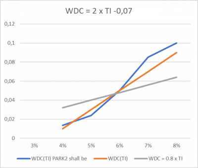
In a pre-analysis the ratio between back and front row power is found by TI bin, which then is paired with similar ratios for calculations with different WDC values. This gives the following relation between WDC and TI for PARK2:
Advanced modelling of WDC by TI based on detailed Power by TI analyses.
The good thing is that a similar analysis on another UK offshore wind farm with access to detailed 10-min data gives a similar result. Therefore, the advanced option for WDC(TI) is added as an alternative to the general recommendation WDC = 0.8 x TI for offshore.
Here, it is seen how the calculation based on mesoscale data and a WDC = 2 x TI – 0.07, handles the wake loss calculation to almost perfection, where a filter criterion is that minimum 79 of the 80 turbines must be running. This leaves 27.000 10-minute approved samples, which is 26% of available samples for the two years 2008 and 2012 with data available.
HR1 calculation for 2008 & 2012 compared to measurements.
HR1 measured and calculated at TI>6%.
HR1 measured and calculated at TI<6%.
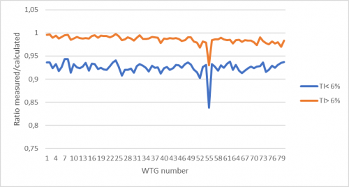
It is worth saying, that the ratio measured/calculated turbine by turbine is good for both higher and lower TI:
Measured/calculated for lower and higher TI for HR1.
There are no signs of “curtains” or east-west bias meaning the wake model handles the site to near perfection. The bias for low TI for all WTGs is caused by mesoscale data having too high wind speeds at low TI. This could be a blockage issue.
But it is good to see how the much larger variation in production between the middle and end row wtg’s at low TI is captured well by the wake model with the advanced settings.
Long term calculation of HR1 compared to measured.
With the advanced wake model settings, close to 20-year operation can be calculated and compared to monthly measurements. A very fine agreement is seen, but also that there are some months with quite high losses. From 2018 we know that one turbine has been taken out of operation permanently due to lightning damage.
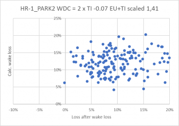
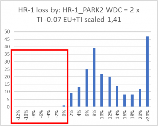
The calculated wake loss vs loss on top of wake loss and binned loss.
The left-side graph above shows no correlation between loss after wake loss and calculated wake loss, which is good. The red square in the right-side graph shows where there should not be any data, apart from mesoscale bias related. The loss/mesoscale bias is nicely normally distributed as should be expected with this very long dataset.
| Apart from "extraordinary" losses mean values are | All | Extraordinary | ||
| Average if <10% | if < 15% | |||
| HR | 6,6% | 8,3% | 17,2% | 8,9% |
The table above shows “normal” operational losses in the size order of 7-8%, of which ~1% is grid loss and the remaining is availability, sub-optimal performance AND market regulation. The extraordinary loss by major downtime and possible market regulation is ~9% seen over 20 years.
Horns Rev 2&3 detail validation of wake model
The wind data used is the EMD-WRF Europe+ dataset. While there can be a bias, which can violate the wake model validation, it has the great advantage that it can be compared to actual production from the Danish Stamdataregister. This is done month by month, which results in a much better validation basis than for statistical calculations in spite of missing 10-minute data as we had for HR1.
Comparing calculated wake losses with all losses including wake loss, HR2 left, HR3 right.
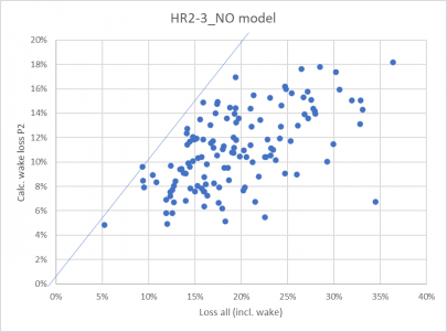
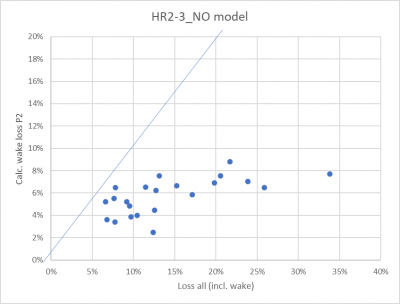
First, a look at the production data compared to the calculation without a wake model. Here the calculated wake losses by PARK2 (DTU default WDC 0.06) is plotted against the losses by the wind model calculation, without wake loss calculation. Left is HR2, right is HR3. It is seen on the trend how a significant part of the loss is related to wake loss. This is very clear for HR2, less for HR3 due to short operation period, including start up period.
It is to expected that there are no data above the blue line, as the calculated wake losses then would be too high (or the wind data biased). A few points above the line are ok due to the lack of precision of the mesoscale data and the fact that there are no stability or TI correction month by month.
It is seen that the calculated wake losses by PARK2 vary by month from 5-18% for HR2 while they vary from 2-9% for HR3. But the total losses based on the wind model varies much more, and this is a problem for the validation, that we cannot separate wake and other losses precisely.
Below the calculation with wake loss is compared to the measurements:
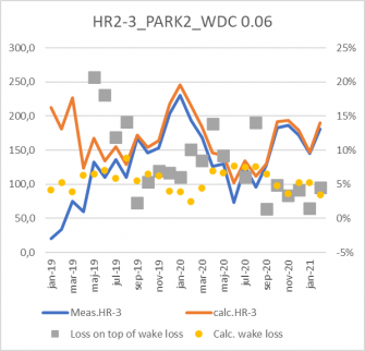
Monthly calculated and measured production for HR2.
Viewing the monthly figures gives a good idea if the wind model seems reasonable. And it does. The grey dots show the loss after wake loss and the yellow the calculated wake loss.
Calculated wake losses and seen "other loss" for HR2.
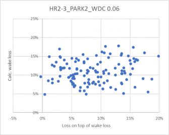
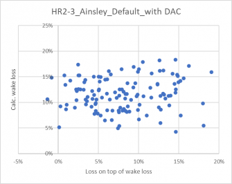
Above to the left is seen for HR2 that there is no systematic trend that losses are higher/lower where the calculated wake losses are high/low. This is a good indication that the wake loss calculation does not seem biased.
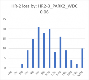
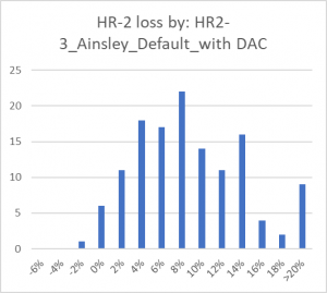
To the right the loss distribution after wake loss reduction in calculations. This looks ok, although we do not know the monthly operational losses. Looking at averages, where extremes are taken out:
| Apart from "extraordinary" losses mean values are | All | ||
| Average if <10% | if < 15% | ||
| HR2 | 6,4% | 8,1% | 11,4% |
| HR3 | 5,4% | 7,2% | 18,9% |
Probably acceptable loss figures for the “normal operation”, where some grid losses must be assumed for the internal cabling (substation and sea-land cable losses are not subtracted in production figures. Measurements are at the substation on the WTG side). But the availability and sub-optimal WTG operation losses are dominant together with possible market regulation.
It thereby seems that PARK2 (WDC 0.06) and the wind data basis handles the calculation well.
Then we have a reference for the Ainslie/DAC test.
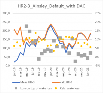
Calculated and measured + losses by Ainslie DAC calculation.
The Ainslie DAC-based calculation performs like PARK2 for HR2.
A similar loss table as for PARK2 justifies that the calculation works well, although the HR3 losses seem too low (too high calculated wake loss for this farm).
| Apart from "extraordinary" losses mean values are | ||
| Average if <10% | if < 15% | |
| HR2 | 5,4% | 7,5% |
| HR3 | 3,2% | 4,6% |
Timeseries calculated and measured by month for HR3.
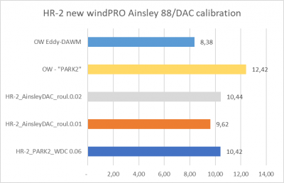
Comparing Ainslie/DAC with PARK2 – both with default settings. That the losses get negative with Ainslie DAC but not with PARK2 indicates that Ainslie/DAC calculates too high a wake loss for this wind farm.
| HR2 results | Calculated wake loss |
| HR2-3_PARK2_WDC 0.06 | 10,4% |
| HR2-3_Ainslie_ | 11,1% |
| HR2-3_PARK2_WDC = 2xTI-0.07 | 10,2% |
The main results of three calculation variants for HR2 as time step calculations for the full HR2 operation period are shown above. Note the PARK2 with WDC(TI) is based on the EMD-WRF Europe+ TI, which is scaled with factor 1,41. The advantage of making the wake loss TI depending per time step is that the wake losses are calculated more precisely. This way sites with higher or lower TI will be handled more precisely.
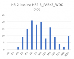
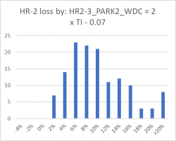
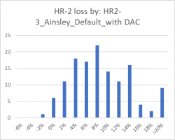
Monthly loss distribution by loss bin for HR2 and different calculation variants.
Lillgrund, Sweden offshore project
This project is special due to the dense spacing - around 3.2x the rotor diameter (RD). The main wind direction is from WSW, along the row orientation.
Measured and calculated from Performance Check, month data (includes “other” losses).
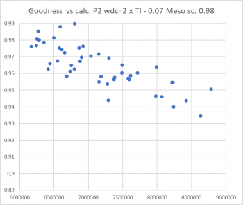
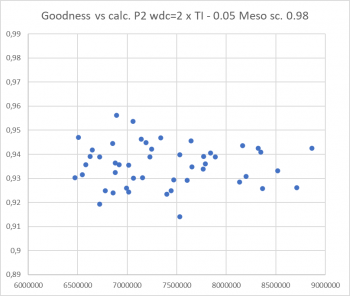
Shown above is the output from the PERFORMANCE CHECK module, where both measured and calculated turbine by turbine can be seen. Data is filtered by taking out larger down times in both measured and calculated values. Monthly production data for each turbine for five years (from December 2008) is used. The calculation is based on mesoscale data. In general, a very good match, using PARK2 WDC = 2 x TI -0.05. Thereby subtraction of 0.07 is replaced with 0.05, which is a fine-tuning handle, that in this case change the calculated wake loss from 28% to 26%. The tuned version calculates all WTGs within +/- 2% of measured with respect to differences in wake loss. Other loss is assumed the same for all WTGs after outlier filtering.
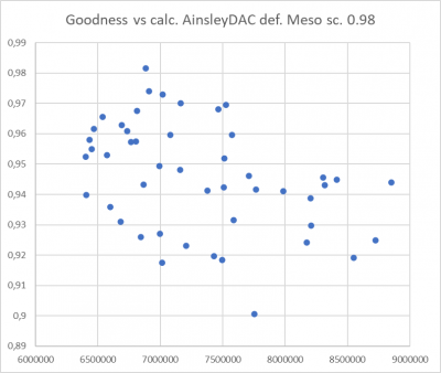
The calibration tool: goodness vs calculated, PARK2 adv. default (left) and tuned (right).
Showing the goodness (measured/calculated for concurrent outlier filtered data) is a good way of finetuning the wake loss model. If there is a down or up trend, the wake model is incorrectly calibrated as seen to the left, where the highest calculated (free in main wind direction) has the lowest goodness. Thereby too high wake losses are calculated. Here mesoscale data are scaled 0.98 which probably are a reasonable size order giving round 6% avg. loss on top of wake loss for the outlier filtered data.
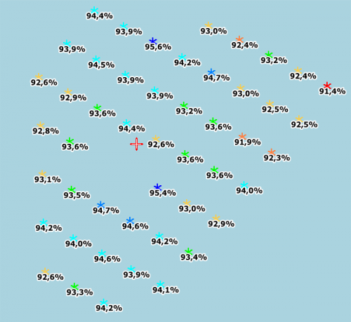
Wind farm layout and ratios measured/calculated P2 tuned, Lillgrund offshore.
The calculated wake losses are for three variants:
- PARK2, WDC = 2 x TI – 0.07 (advanced default): 28%
- PARK2, WDC = 2 x TI – 0.05 (best WTG by WTG reproduction): 26%
- Ainslie default settings: 27%
Thereby both PARK2 and Ainslie by default settings are close to the fine-tuned most trustworthy result for this very high wake loss site.
Ainslie with WTG by WTG goodness slightly poorer than PARK2.
Wake calculation validation for large Egypt wind farm
This project is checked each half year for five years, where wake modeling is tested. So here we know very precisely what the wake losses are. Below a comparison for a specific period, 1½ year, with good mast measurements in front of park including Turbulence measurements.
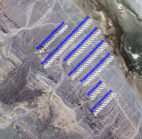
The in-row distance is ~3 RD, between rows ~14 RD. The turbine model is the Gamesa G80 with 60m hub height.
Layout of the Egypt wind farm.
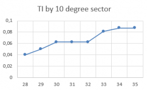
The special thing for this site is the uniform wind direction, NW, but with the specialty that in WNW the TI is very low, around 5%, while in NNW it is more “normal” for onshore, close to 9%:
TI by direction sector.
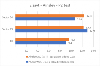
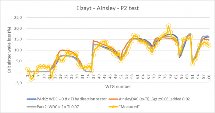
Therefore, the Ainslie model is tested particularly for sectors 29 and 34, to compare to PARK2 wake modeling at low-high TI conditions. The results:
Egypt large wind farm wake loss calculations.
Ainslie is used with onshore background roughness 0.03, but added roughness as for offshore, 0.02. With these settings Ainslie compares well to PARK2. Both calculate 9-10% wake loss, which is the correct value based on 5+ years of measurements. Ainslie does calculate a lower wake loss in the low TI sector 29 compared to PARK2 and the reverse in high TI sector 34. This is as expected from the offshore tests, where it was seen that Ainslie model does react less to changes in TI compared to PARK2.
There is no complete agreement WTG by WTG, but all in all good agreement. In addition, the test of new offshore recommendations for PARK2 is included: WDC = 2 x TI – 0.07. This is seen to work very similarly to the PARK2 calculation with WDC by direction based on WDC = 0.8 x TI.
Setting the added roughness for Ainslie to 0.1 (onshore recommendations) calculates some higher wake losses, although just a few percentage points. This illustrates how sensitive the Ainslie/DAC is to added roughness for a wind farm covering a large area. The site although must be considered “offshore -like” where also the PARK2 model needs offshore settings to behave well. The combination of low TI, low roughness and high wind speeds makes it offshore similar, and this probably explains the need of handling this site with offshore settings.
Large UK offshore wind farm complex
How does the wake modeling work for very large wind farm complex, not just a single or two wind farms? This we will try to answer by the Irish sea wind farm complex with Walney etc. see below.
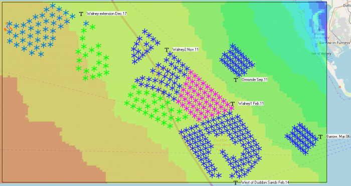
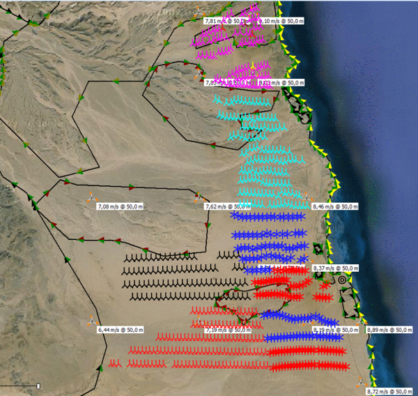
Large wind farm complex covering 45 km east-west.
Monthly data from each wind farm are available. The Walney extension consists of two types of turbines, Siemens Gamesa 7 MW (green) and Vestas 8MW (light blue).
| Period | From | To | Wind farms | Months | Years | WTGs acc. | WTG type |
|---|---|---|---|---|---|---|---|
| 1 | Jan-08 | Jan-11 | Barrow | 37 | 3.1 | 30 | V90 3MW |
| 2 | Jun-12 | Jan-14 | +W1, W2, Ormonde | 20 | 1.7 | 162 | SWT 3.6 (107+120) Repower 5M |
| 3 | Oct-14 | Nov-17 | +West of Duddon Sands | 38 | 3.2 | 270 | SWT 3.6 120 |
| 4 | Aug-18 | Dec-20 | +Walney extension | 29 | 2.4 | 357 | V164 8.25 + SWT 154 7MW |
An interesting feature of this wind farm area (and in windPRO) is that data can be grouped in 4 periods with different wind farms in operation. Thereby it can be checked if the wake models capture the increase in losses due to new neighbours.
A calculation model is setup based on multiple EMD-WRF Europe+ mesoscale data points to include the horizontal variation of the wind climate in the region. Calculation is by hour, only including operating turbines in relevant months. The months with partly operating wind farms are not used.
While we do not have information on losses apart from the difference between calculated and measured, we evaluate the performance of the wake modelling based on the loss difference from period to period.
Four periods, where different number of wind farms are operating, are analyzed. Note that there are months with extremely high losses, where some wind farms have been out of operation most of a month, which influences the data too much. Therefore, we take out months with more than 15% losses to make conclusions based on “normal operation”:
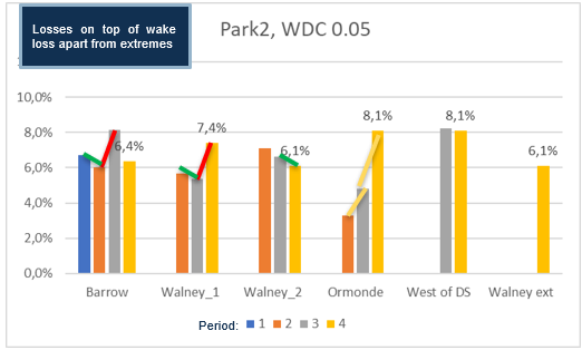
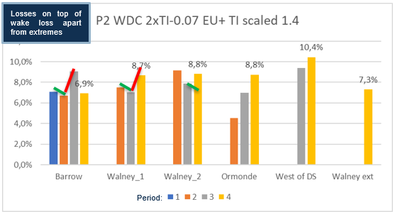
Losses on top of wake losses for months with < 15% loss (74% of month data).
Losses on top of wake losses for months with < 15% loss (74%) for the four periods with a different number of wind farms in operation.
The markers show:
Red – the losses increase with new wind farm that must be expected to have an impact.
Green – the losses decrease with new wind farm that must be expected to have an impact.
Yellow – change in loss is not expected related to new wind farms but change in operation.
There are examples where the wake model does not seem to capture the effects of new wind farms well enough. Conversely, there are also examples where the wake model calculates too much loss increase. This leaves no clear conclusion.
As an alternative approach, advanced wake tuning is applied:
Calculation with advanced WDC(TI) for offshore.
Almost same picture, 71% of 535 months data used. But some higher losses than previous calculation with fixed WDC = 0.05.
The red-green differences from the previous chart are overlayed. This shows how Walney 2 previously had decreasing losses, but now has increased losses. The other examples also show slightly smaller loss increases as neighbor farms are built, compared to the losses using WDC=0.05.
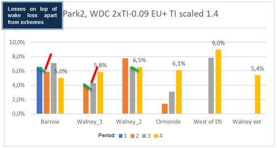
By further adjusting the offset from -0.07 to -0.09 returns more months fulfilling the 15% threshold, 77%.
Compared to using 2xTI-0.07, the losses are now around 2 percentage points smaller, due to higher calculated wake losses. And this also reduces the change of losses as neighbor farms are built. Some of the change partly disappears, some partly get reduced.
Very importantly, the losses are now comparable to the losses observed at the detailed 10-min calibrated sites, which is around 4-7% for most wind farms and periods. The reason why West of DS (Duddon Sands) has higher losses can be related to power curve or Ct curve issues. Similarly, the bias in the other direction for Ormonde can have multiple causes (mesoscale wind, Ct curve, power curve), but the increase in losses does not seem wake related, but related to operational problems:
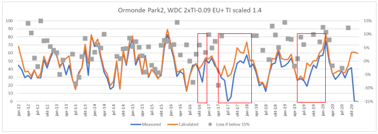
Ormonde measured and calculated by month.
Above, observe the “heavy” drops, first in Oct. 2016 then several months in 2017-18 and again in 2019 and 20. This does not seem wake loss related but caused by operational issues. This explains the loss increase by period, which could be even higher if the model setup for this windfarm was tuned further.
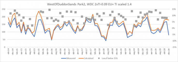
West of Duddon Sands measured and calculated by month.
West of Duddons Sands is performing in a quite stable manner month by month, but with quite high losses every month. This is unlikely a wake modeling issue, but more likely a turbine data issue. The calculated production is a little too high every month probably due to mesoscale bias or power curve bias.
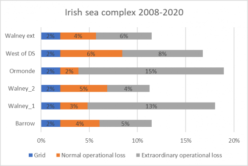
Assumed all time losses in addition to wake losses for the 6 wind farms.
As mentioned, Ormonde and West of Duddon Sands probably skew 1-2% in each direction, maybe simply due to using too few mesoscale wind data points – only 3 points were used in the calculations. While 3-5% normal operation loss seems reasonable, the serious problem is the months with > 15% loss, which might perhaps include market regulation?
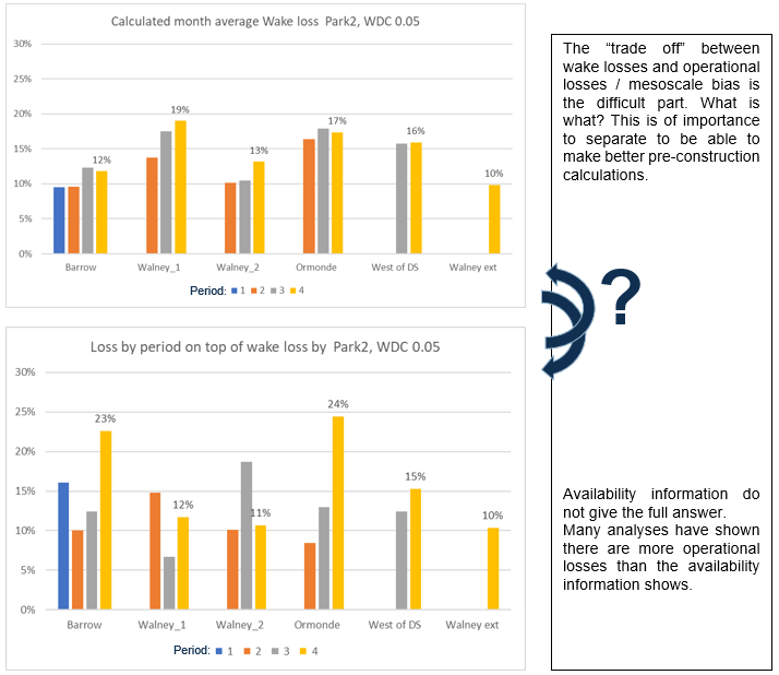
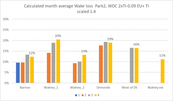
Final calculated wake losses per period per wind farm.
With the “most plausible” calculation setup based on losses on top of wake losses, these are the calculated wake losses for the four periods for the six wind farms. The reason why Barrow and Ormonde have lower calculated wake losses in period 4 than 3 is due to the wind speed and direction distribution. Walney 1&2 have higher calculated wake losses in period 4 due to the impact from the Walney extension.
Finally, a comparison to Ainslie DAC handling of this large area:
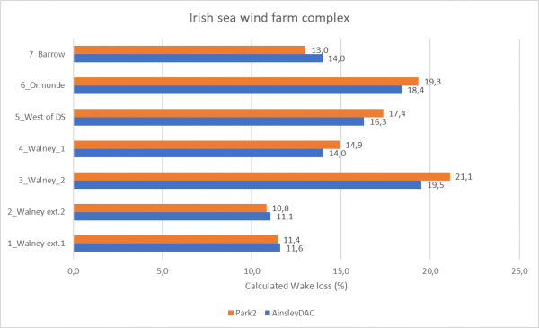
Calculation for 20y all wind farms running full time, compare PARK2 and Ainslie.
As seen, there are differences between PARK2 and Ainslie DAC. In general, these are small, typically below 1 percentage point. But most importantly: the two wake models seem to handle even these large wind farm complexes very well. There is no indication of serious problems.
Very large Egypt wind farm complex
With 700 WTGs, Zafarana is probably the largest onshore wind farm complex measured in number of turbines.
Zafarana wind farm
Wind is always from northern directions. TI is round 9%. Using PARK 2 with 0.8 x TI gives a good match calculated vs measured:
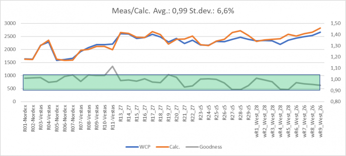
Row by row calculated and measured production with ratio meas/calc.
In 2011 EMD calibrated the wake model for this site. The result was a need of increased roughness to compensate partly for:
- The original N.O.Jensen model (PARK1) did not reduce calculation result “enough” for the down wind part of the site.
- There were meso scale effects which the traditional WAsP setup did not include.
In 2022 using PARK2 and mesoscale model data, this site is calculated quite accurately without any needs for added roughness to compensate for model and data inaccuracies. This shows how continuous model and data improvements within windPRO have brought the calculation model accuracy very far within the past 10 years.
2011 calculations, increased roughness as model compensation very deciding.
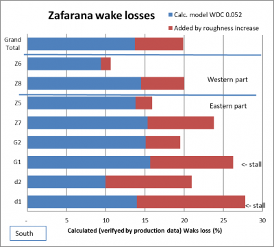
With a decent model calculation setup in 2011, the predicted wake loss would be calculated to 13,5%, where real operation data showed 20%. The 2011 “solution” for calibration of the model setup was to increase the roughness. In 2022 the combined mesoscale model data and PARK2 are capable of handling this site just as well without roughness calibration.
Conclusions on wake modeling
WindPRO offers three alternative wake model concepts:
- N.O. Jensen (PARK1, PARK2, NO2005). EMD recommends PARK2
- Ainslie with DAC (Deep array correction)
- WakeBlaster (external model from ProPlanEn)
For the two first wake models, blockage can be calculated as part of the wake calculation. Although typically this will only reduce production around 0.5% for 100 WTGs and is not TI dependent. Therefore, there is no significant change in calculated losses by present blockage implementations based on state-of-the-art scientific methods.
All three model variants calculate wake losses with reasonable accuracy and similar magnitudes. This has been validated based on several wind farms with access to detailed 10-minute operation data per turbine and verified by comparisons of the different wake models on real wind farms and on simulated wind farms with tests of calculated wake losses vs. the size of wind farm.
The key input for concepts of Ainslie with DAC and WakeBlaster is the Turbulence Intensity (TI), which determines the level of calculated wake loss. For N.O. Jensen it is the Wake Decay Constant (WDC), which EMD recommends being adjusted based on TI.
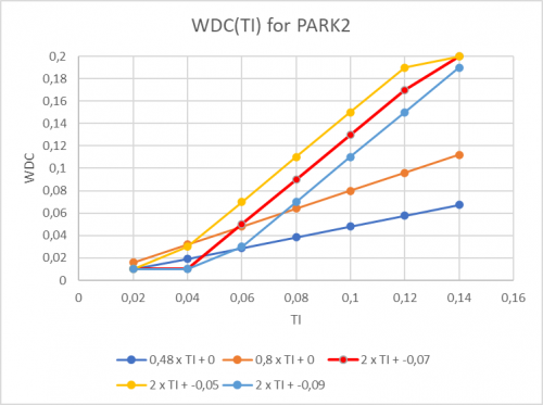
Detailed data analyses show a trend towards wake losses being even more TI-dependent than the models calculate. This can be handled by N.O. Jensen by making the WDC(TI) more “aggressive” than so far recommended, illustrated below:
'WDC(TI) for different configurations with PARK2
The updated recommendation for PARK2 onshore is to use WDC = 0.6 x TI. For offshore and low TI onshore sites EMD recommends using a WDC = 0.8 x TI. However, we do see in data/validation examples that the more aggressive relation WDC=2x TI -0.07 for offshore/low TI site works better when subdividing data in TI bins.
The subtracted 0.07 can be used as tuning parameter, where for some sites like Lillgrund offshore with dense spacing 0.05 works best and for very large wind farm complexes like the Irish Sea Complex 0.09 works best. Most likely it is a question of wind farm size. For windfarms with around 100 WTGs the 0.07 seems to work best. The reason for more or less reduction can be that bigger wind farms has a greater impact on the wind regime of the site, which then can be compensated by a lower WDC. A lower limit on WDC of 0.01 and higher limit of 0.2 is recommended.
An important piece of information is that for offshore, the EMD-WRF Europe+ and similar pre-run mesoscale datasets have too low a value of TI offshore. EMD recommends scaling this TI with √2 (=1.41). This experience-based adjuster is built-in for the discontinued EMD ConWx mesoscale dataset and the EMD-WRF On Demand data. But while onshore validations show better agreement on TI onshore without this adjuster, it is not included in EMD-WRF Europe+ and similar datasets.
Calculating for the new generation of offshore turbines from 7 MW and up, there seem to be a slight overestimation of the wake loss with Ainslie DAC model. This is based on a few tests so far.
