Validierungsbeispiele und Modellprobleme
Zur deutschen Hauptseite | Alle deutschsprachigen Seiten
Meso data long term consistency
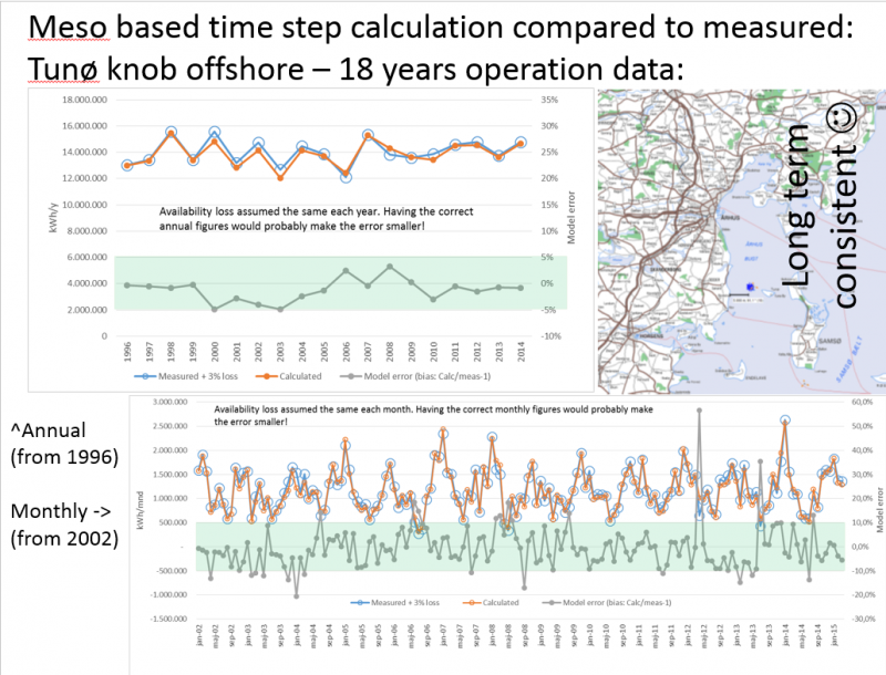
Image:Long-term consistency using Meso data
This screen shot shows how well the meso data based calculation matches measured production on a time scale of 18 years. The Tunø Knob offshore wind farm has been operating very well with few problems and a high availability during all 18 years. Thereby, it is a good validation case. It is seen that year-by-year model errors are within +/-5% and month by month within +/- 10%, apart from few months where the problems probably were related to availability issues.
Deep array wake loss model
Horns rev 1, Danish Offshore project
A more comprehensive test of the wake models, especially with deep array settings, has been performed on the Horns Rev 1 wind farm, where EMD has access to wind measurements as well as production data at a 10-minute level for one year. A calculation was set up and data loaded in the Performance Check module for detailed filtering and evaluations of the measurements against calculations on different aggregation levels. Note the deep array settings are only available for the time-step based PARK calculation, for which only the NO2005 model is available.
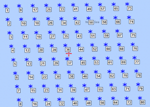
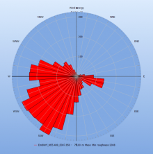
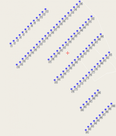
Image: Wind farm layout and the direction distribution of energy
Note the turbine orientations give the densest spacing in north, east, south and west sectors. The results are evaluated in 30-degree sectors, but calculated in 1-degree steps. The first is shown for the 360 degree calculation, meaning a full year with all data.
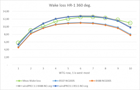
For the total wind farm, with 360 degrees and all wind speeds, the wake loss is calculated as 10.8% with the original N.O.Jensen model, exactly as measured, but with smaller deviations by turbine row. The "measured" wake losses are found by calculating with 1 year of 10-minute data and finding the ratios of measured/calculated as averages for all non-error time stamps by use of the windPRO Performance Check module. Based on the prediction error and the calculated wake loss, the measured wake loss can then be established for the sample.
Image:NO2005 variant and original N.O. Jensen model
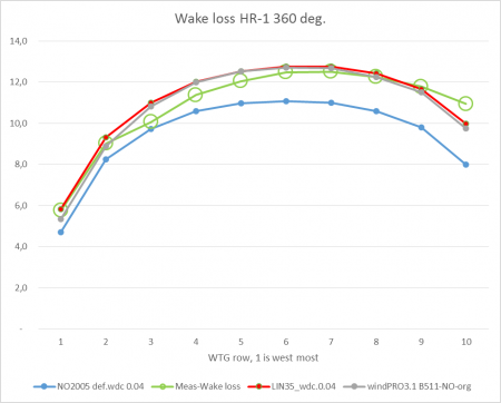
Inclusion of mirror turbine wake (light blue line), which is new in 3.1 for NO2005 model, has almost no impact for this wind farm size. Orange line is without mirror wake.
The NO2005 variant is seen to calculate less wake loss than the original N.O.Jensen model, and too low compared to measurements.
There is a possibility to improve the NO2005 variant by using the deep array settings when calculating by time step:
Image:The deep array loss settings for time step calculations
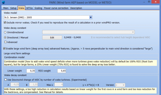
The linear weight of 35% is recommended. The additional option “Use downwind change of WDC by number of wake turbines are only for going down at a very detailed level. This is now in a version 2, that work somewhat differently and require new parameters. This can be used for “ultimate tuning” when very good data are available to calibrate against. See later validation tests.
Image:Using 35% linear weight in deep array model setting solve
Looking at a more detailed analysis by wind direction sector, two deep array settings are tested and compared to a baseline:
- 0. NO2005 standard, WDC 0.04 - the baseline.
- 1. Linear weight 35%, WDC 0.04.
- 2. Linear weight 100%, but with increased WDC from 0.04 to 0.07.
Setting 2 matches measurements almost perfect at 360 degrees, but looking at individual directions (see below), it is seen that this might not be a robust solution for all projects. For the directions where turbines are most densely spaced (north, east, south and west), an under-prediction is observed for the most wake-affected turbines. Moreover, it can be tricky to “guess” which WDC shall be used. Setting number 1 handles all directions somewhat better (i.e. there is no systematic bias), and the default WDC is used. This is likely to be a better solution when the wind farm performance is not already known.
The graphs below shows direction by direction in 30 degree sectors and illustrates how the measured/calculated ratio comes out across the average row by row, where all rows are arranged so the upwind row is row 1. The goal for a good wake model is horizontal lines in such graphs – the absolute values are less important, as they can reflect a wind speed bias.
Image: Setting 0: Calculation with default NO2005 model, WDC 0.04
Row 1, leftmost, is upwind row. Wake losses are under estimated the more downwind in the row.
Image: Setting 1: Calculation with 35% linear weight
Reasonably straight lines for all direction sectors, meaning the wake model settings work well. (almost no data from NNE and ENE may explain poor behaviour here).
Image: Setting 2: Calculation with 100% Linear weight and WDC 0.07
Wake losses are over-predicted in back rows for the direction sectors where turbines are oriented along the sector.
As observed, the more upwind the turbines (higher row numbers), the more energy under-prediction (wake loss over prediction) is seen for the east, south and west directions with 100% linear weight – this is somewhat critical. There are, due to the nature of the data, no perfect matches for any row. The north sector is not included due to very few data points in this sector. The presented case study can be concluded with no doubt that setting 1; the NO2005 with 35% linear weight is the best alternative.
The original N.O. Jensen model is not tested by direction, as the time-step based calculation concept cannot use this model and the very detailed analyses are more difficult to perform.
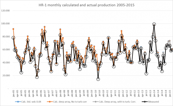
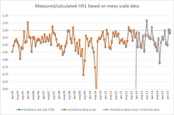
In addition, and partly for evaluation of the mesoscale time consistence, a longer period is calculated, WITHOUT filtering poor performance problems out. The results can be seen in the figure below:
Image:Monthly measured and calculated
The graph above shows partly the measured results (including availability loss and internal cabling grid loss) and partly the calculated results based on the standard WDC of 0.04. The deep array loss model alone and the deep array loss model combined with time step turbulence from mesoscale data (the last one is only from 2013, since meso data does not include turbulence before 2013). As can be seen, the difference in the three calculation models are hardly visible in the graph, but there are differences, which can be seen in the graph below:
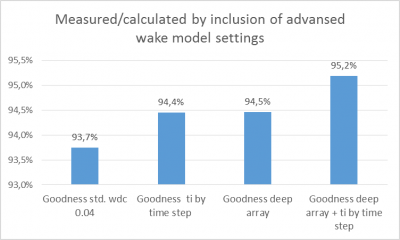
Image: Summarised result with different corrections
Summarizing the results for the different calculation setups since March 15, 2013. While the losses are assumed to be in the order of 5% (2% grid and 3% availability loss), it is assumed the most refined calculation setup provides the best result. It is noted that use of the deep array loss model calculates 0.8% higher loss and the WDC changed by time step adds a further 0.7% loss. In combination, that is an addition of 1.5% loss. This seems very little, but, with 10% wake loss with a standard calculation, it is an increase in calculated wake loss of 15%.
Image: Monthly ratios measured/calculated
The results shown in the above graph are shown as ratios. The reason some months have higher measured values than calculated values is because mesoscale data is not that accurate. Note that only 6 months out of 125 exhibits higher measured values than calculated. For the months with lower measured values than calculated values, it is most likely due to availability problems. Here is seen how the added wake model corrections give slightly lower calculation results (higher ratios).
The conclusion of the test with HR-1 calculations is due partly to the Mesoscale wind data performing “very precisely” (no post scaling) and partly to the deep array model modifies well. That the WDC is decided by TI adds further improvement. All in all, we recommend including all corrections. However, we must set a “warning flag” regarding the use of the meso data turbulence. Usage of the meso data in this manner has proven to provide correct results at this and a few other tested sites, but no comprehensive validation on many sites has been performed so far.
Lillgrund, Sweden offshore project
This project is special due to the dense spacing - around 3.2x the rotor diameter (RD). The main wind direction is from WSW, along the row orientation.
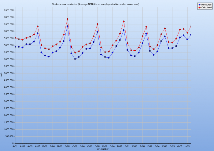
Image: Measured and calculated from Performance Check module
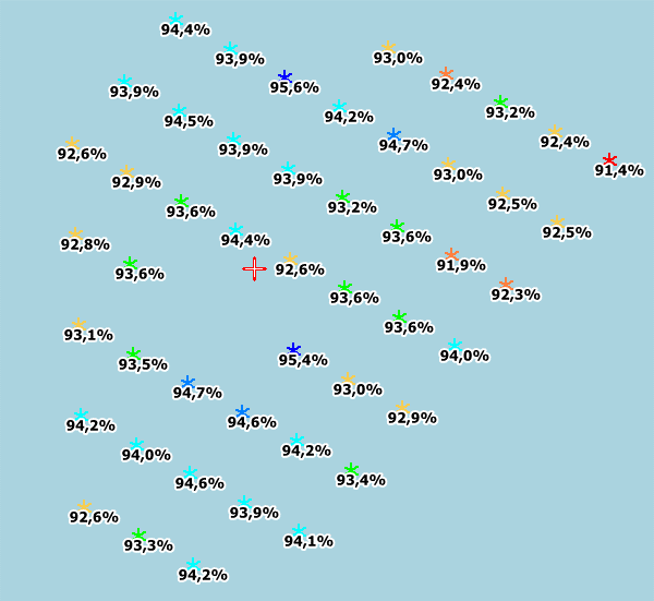
Shown above is the output from the PERFORMANCE CHECK module, where both measured and calculated turbine by turbine can be seen. Data is filtered by taking out larger down times in both measured and calculated values. Monthly production data for each turbine for 5 years (from December 2008) is used. Calculation is based on Mesoscale data. In general, it is a good match, but zooming in based on the ratios shows deviations. This is especially evident when based on the “standard” wake settings. Using the new deep array wake loss options help.
Image:Wind farm layout and ratios measured/calculated, Lillgrund offshore
As seen by Horns Rev, the new deep wake default settings improve the results quite a bit. The back row calculation performs, essentially, better. It is also observed how the 25% linear weight, by itself, does most of the modification. However, it overestimates the wake losses for the inner turbines, and it still underestimates the back row wake loss to a certain degree. These two problems are both improved by including the WDC reduction by number of up wind turbines. Note, although, that this option does not change results drastically - it just fine-tunes a bit. But, it is a good change, overall, in that larger windfarms with more rows will have a greater improvement in the wake decay results than previously.
Test of model vs wind farm size
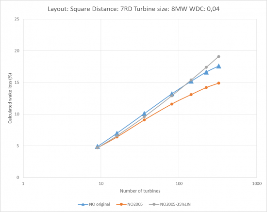
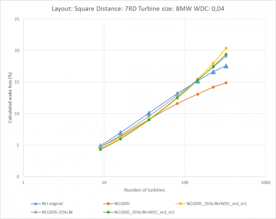
Image: The development of calculated wake loss by wind farm size
Using a logarithmic x-axis, the calculated wake loss increases almost linearly with wind farm size when spacing is kept constant.
For small wind farms (< 20 turbines), the three variants calculate almost identical results. The deviations increase as project size increases.
By the time the project reaches 100 turbines, the NO2005 calculates around 2% more AEP than the original N.O. Jensen model. At 250 turbines, this increases to 3%.
Using a linear weight of 35% in the NO2005 combination model, brings the result closer to the original N.O. Jensen model and AEP deviations are less than +/- 1%. Mirror wake is used in NO2005 in the figure above.
Test of reduced WDC by upwind turbines on Horns Rev-1
Image: Wake loss test. Blue graphs show the two WDC reduction methods
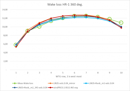
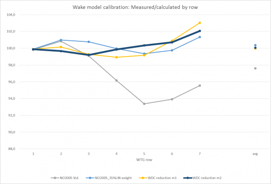
The presented graph shows the variation in calculated wake loss by row for several methods.
Green line represents the observed wake loss, the red line represents the wake loss calculated with the original N.O. Jensen model. The two blue lines represent the wake calculated based on time varying data with NO 2005 method with 35% linear weight and WDC reduction by using method 1 and 2. Finally, the orange line represents the wake calculated with NO2005 with 35% linear weight in combination model and mirroring effect (for more details see Park model revision paper).
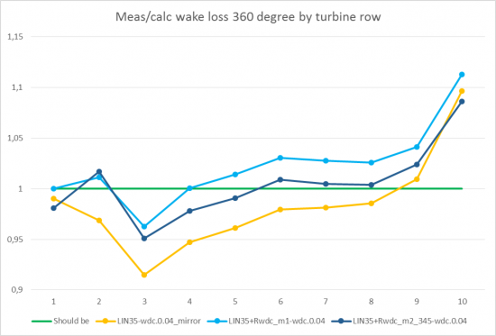
Although the deviations between all methods are small, it can be seen that the results from the time varying calculation with NO 2005 method and WDC reduction gets closer to the observations than the rest of the methods. Zooming in, a clearer picture is seen:
Image: Ratios measured/calculated wake loss illustrates the differences more precise
Part of the reason for the lack of full match can be explained by the data. But the trend is clear, the reduced WDC by upwind turbines straighten out the lines by calculating less wake loss in the “inner rows” while the outmost rows are calculated roughly as without WDC reduction. If the wind farm were larger, the reduced WDC would result in higher calculated wake losses compared to not using reduced WDC.
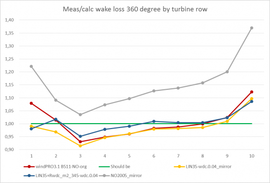
Image: Comparison to the Original N.O.Jensen model and NO2005
Compared to original N.O.Jensen model it is seen that the NO2005 with 35% Linear weight’ calculates slightly higher wake losses (lower Meas/calc wake loss ratio). Compensating with reduced WDC, slightly lower at the rows which get too high loss calculation by org. NO model. But the most important NO2005 modification is the 35% Linear weight in the combination model. Without this, the NO2005 (grey line), calculates round 15% too low wake loss, which in this example mean about 1.5% too high AEP.
Test of reduced WDC by upwind turbines on Egypt wind farm
Here the distances between the rows are essentially larger, while the in row distance is much smaller compared to HR1. Main wind direction is almost uniform, and row 1 is the upwind row. The Figure below presents the wind farm design.
Image: Wind farm layout, main wind direction is from NW
Approximate RD spacing: in row: 3, between rows: 14.
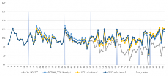
Image: Egypt wind farm with 100 turbines in 7 rows
It is seen how the NO2005 model under predicts wake losses remarkable for the back rows (the measured/ calculated AEP is low for back rows). The “base” WDC is here set differently by wind direction based on measured turbulence.
With the applied 35% linear weight problem is almost solved. Including the WDC reduction by upwind turbines improves slightly for rows 2-3, but for the back rows 6-7 it is arguable if an improvement is seen, however other reasons could be behind this.
Image: Turbine by turbine measured/calculated energy production
Quite some deviations within the rows are seen, which can be partly explained by topographic*) issues, partly by operational issues. It is therefore difficult to judge if the row average values give a correct picture of which model variant is the best. A reason for the small under prediction of the back rows with the WDC reduction model, can here also be the use of too low WDC. Setting this slightly up, would lower the measured/calculated values especially for the back rows.
The good thing is that using the same settings for the WDC reduction as for Horns Rev example, still work well on a fully different layout.
- ) It shall be noted that later calculations on the wind farm above show that with more accurate elevation data the most remarkable outliers are brought in line. It can thereby for sure be said that the outlier problems mainly are related to lack of elevation data quality.
Test of WDC reduction on varying wind farm sizes
Image: WDC reductions by upwind turbines tested on varying wind farm sizes
As seen from the graph, the calculated wake loss with NO 2005 35% linear weight model (grey line), as the major model parameter, and the two applied WDC reduction models (yellow and green), shows quite similar values, by looking at the average for the entire wind farm. The benefit from the WDC reduction is that it compensates for the over prediction of the wake losses typically for front rows (2 to aprox.5) and compensates for the under prediction of the wake losses for the downwind rows.
WAsP versions modifications
The WAsP model itself will not be explained in detail here (see Risø/DTU WAsP manual), only the changes of high importance for the user in the more recent versions. From the very first versions, until and including ver. 9, the model itself has only changed marginally, and the calculation results, thereby, also. The major improvement during the earlier WAsP model changes is the capability to handle more map file points. However, from version 10.0, model modifications have been made. These mainly relate to stability correction handling, especially for offshore and near shore, but, also, the roughness map interpretation has been improved. The corrections were partly included in ver. 10.0, but first fully implemented in ver. 10.1 and 10.2. We, therefore, do not recommend using ver. 10.0 in offshore or coastal regions. The corrections relate to the default heat flux parameters - the way roughness in a coastal zone is interpreted and to formula modifications. The result of the corrections is a smoother change between on shore and offshore stability correction. The windstatistics for offshore is different if it is generated from WAsP 9 or 10.2+.
This means that an offshore or near shore windstatistics made from WAsP 9 SHOULD NOT be used in any version from WAsP 10.2 or vice versa.
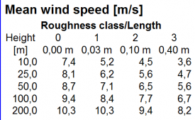
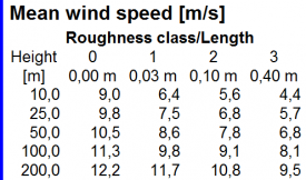
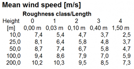
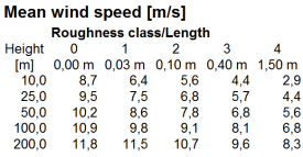
This can best be illustrated by an example: 4 windstatistics are generated from the same time series data:
Image: Four windstatistic results for Lillgrund offshore, different WAsP versions
Top row is using WAsP 9 and bottom row is using WAsP 10.2. Left column is assuming a class 0 site and the right column is assuming a class 1 site.
In the left column, the class 0 data is almost the same using the two WAsP versions. The highest level is at 200m, although the result is slightly lower with WAsP 10.2 – a part of the formula modification. BUT, for the onshore classes, the wind speeds are essentially higher with WAsP 10.2 - around 0.2 m/s.
This means that a WAsP 10.2 calculation could calculate up to around 10% higher AEP than WAsP 9 at an onshore site, if the data basis were offshore.
In the right column, the onshore site, the onshore class data 1, 2 and 3 are almost identical from the two versions. Again 200m has slightly lower results with WAsP 10.2 – a part of the formula modification. BUT the class 0 data is around 0.3 m/s lower when calculated with 10.2.
This means that a WAsP 10.2 calculation would calculate up to around 10% lower AEP at an offshore site, if the data basis were onshore.
The changes are, of course, not serious as long data is used in the same environment it comes from (e.g., offshore for offshore). But, it should be mentioned that, in the coastal region, where there is part water and part land, quite unpredictable changes can be seen. Here, it will be especially important to use the same WAsP version for generation of windstatistics.
From the tables, it is also seen that, with large hub heights (>100m), WAsP 10.2 calculates slightly lower wind speeds than WAsP 9 – this is so both on and offshore have a general modification of the stability correction model. Based on quality test data in an offshore environment and from tall masts, this correction appears to give a better reproduction of the measurements.
Image: Test case calculations showing the WAsP stability model shift
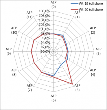
The example above illustrates the improvement regarding smoothing the stability model shift. Two turbines just 200m apart, both around 4 km offshore, are calculated. In sector 5, there is a roughness change from class 0 to class 0.4 at a 10 km distance. The graphs show the ratio of the calculated AEP between WAsP9/WAsP10.2. Looking at the rose, it is seen that, in sector 5, what happens for the two turbines is very different. This is where the distance to the roughness change in sector 5 is just around 10 km. A change from 0 to a higher class decides that WASP 9 shall change between on- and offshore stability in that direction. The parameter: “Width of coastal zone” decides this and can be changed, but the default is 10 km. It’s an obvious inconsistence, which is in WAsP 9, but not in WAsP 10.2. But, the graph also shows how the calculation results are smaller in general with WAsP 9 when the wind come from land, while the 9 and 10.2 results are the same when wind comes from the open sea.
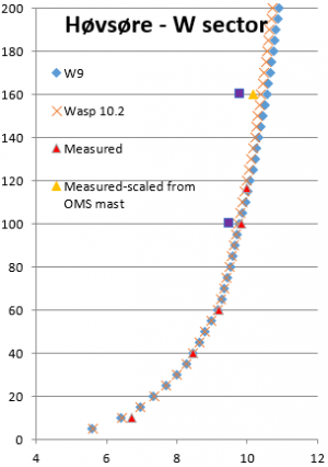
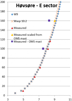
Image: Wind profiles, measured and calculated
A test on reproducing measured profiles in large heights is shown above. It is seen that WAsP 10.2 predicts the vertical profile slightly better than WAsP 9. The 160m points (purple squares) are from another mast nearby and, therefore, not fully comparable to the measured (red triangles). Based on both masts measured at 100m, the 160m point is scaled (yellow triangle), and it is observed that the WAsP calculated profile matches measurements well up to 160m, with a small advantage for WAsP 10.2 relative to WAsP 9.
Tests of calculation in a coastal region with different hub heights
The calculation setup can be seen in the figure on the next page:
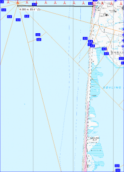
Image: Model setup for test of WAsP model
Based on a met mast 1800m from the west coast, a row of turbines are calculated based on the two different WAsP versions, where the windstatistics are generated with same version as is used in the calculation. The turbine row starts 13.5 km offshore and ends 23.5 km onshore.
Image: Map details for test setup
The map gives an idea of the surface roughness around the test row. The row crosses a large forest area along the onshore part.
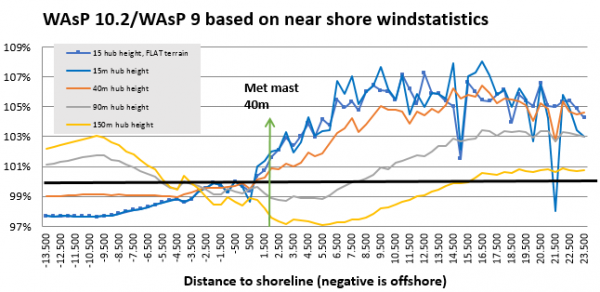
Image: Results of WAsP 10.2 vs 9 calculations
For a 15 m hub height there is two variants: one calculated without orography and one with. For all other heights, orography is included, and for all calculations, digital roughness maps are included.
It is seen that there are quite some differences between the WAsP 10.2 and WAsP 9 results, but it is not that easy to come to a clear conclusion as to why. Starting with the 150m hub height, WAsP 10.2 results are around 1% lower the first 3 km offshore, but then rise up to 3% higher around 10 km offshore. Onshore, the results are lower the first 15 km, up to 3%, but get then slightly higher. A “reversed” pattern is seen for very low hub heights, but with up to 8% higher results onshore. There is two dramatic peaks in the graph. The leftmost peak is due to differences in roughness interpretation in the two models. The rightmost is due to different orography interpretation. This just illustrates that, besides the major model changes, some minor bug fixes also contributes to the differences and leads to a recommendation to always use the latest version.
In conclusion, there are obvious improvements, and, especially offshore and in coastal regions, we recommend using WAsP 10.2 due to better reproduction of the measured shear. For fully onshore sites (when measurements also are fully on shore) there seems only to be differences when hub heights are > 100m. However, if measurements are in coastal regions, the changes in calculation results can be quite large. We cannot yet say, based on actual turbines, if one or the other models performs better. But the most important conclusion is: Do not use different WAsP versions in coastal regions to generate and use windstatistics!
Displacement height calculation
Image:Test wind farm for displacement height
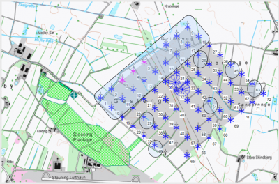
Above is an example of a large wind farm: 67 x 225 kW turbines (31m hub, 29m RD), with a 15 m forest just to the west (main wind direction). This is an ideal test case, except for the production data logging not being very good.
Image: Results of calculation with and without displacement height
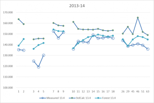
For a shorter period (1 quarter), reasonably good production data is collected for the turbines marked on the map in figure 167 and shown in this graphic. The standard calculation is a calculation based on Mesoscale wind data for the same period as the production data. Note especially the turbine row 10-18. Here, the west most (10) are calculated as having the highest values due to low wake losses. But, the actual production from these turbines is lowest and the production increases towards east. The obvious reason is the influence from the forest. Calculation with the forest model (displacement height calculator) captures the decrease in production very well for the turbines nearer to the forest.
Image: Test of displacement height used for 4000 DK turbines
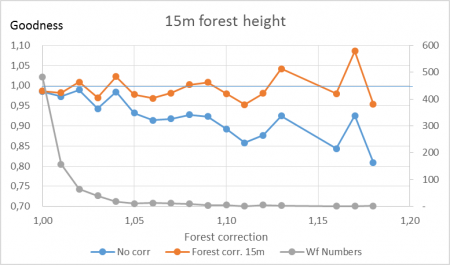
In another example, an analysis was performed for 4000 operating DK wind turbines where calculated results were compared with measured production. The forest concept was tested simply by giving a roughness class of 3 and higher a “forest status”. On the x-axis is how much this corrects the individual wind farms, on average: up to 18% reduction. And, also shown is how the goodness (measured/calculated) is lifted from 80% to almost 100% for most of the influenced turbines. It is obvious that the forest model performs well in improving the goodness of the more forest- influenced turbines, and that it brings the trend closer in line with that of the least influenced turbines.
Elevation model pitfalls
Based on many post construction evaluations, some trends are seen when doing a calculation in elevated terrain. The two major issues are:
- In less steep terrain, higher elevated turbines are under predicted by the WAsP model relative to lower elevated turbines. With WAsP-CFD, similar results are seen, although there is some improvement.
- In steep terrain (>30% slopes) higher elevated turbines are over predicted by the WAsP model relative to lower elevated turbines. The RIX correction can partially repair this problem, however, the WAsP-CFD, or other CFD models, would be a better choice than the WAsP model in this scenario.
Image: Ratio measured/calculated for a site in Germany with elevation differences
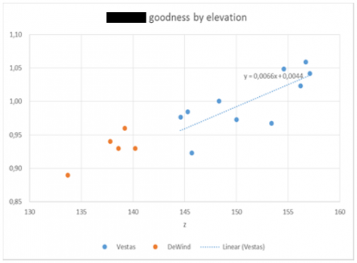
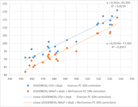
Above is an example from a German site with turbines in elevation from 133m to 157m. A very clear trend is seen in that the turbines with lower elevation are over predicted relative to the turbines with higher elevation - an almost 7% per 10m elevation difference. Based on more internal calculation examples, the value varies from 3- 7% per 10m. This has high importance when having reference turbines with different elevations relative to the new project to be calculated.
Image: Example as in previous figure, but including WAsP CFD calculation
Above is another example, with a less clear trend, but where WAsP-CFD is tested as an alternative to WAsP. For WAsP, a ratio of 7% per 10m is shown, as in the previous example. This ratio is lowered to 3% per 10m when based on WAsP-CFD.
For complex terrain (large steepness), see the WAsP-CFD validation paper on the EMD help desk website.
Checking the Power Curve
The Ce value
A key parameter when checking the power curve is the non-dimensional Ce curve, which can be used for direct comparison of different power curves. If the maximum Ce value exceeds 0.5, the power curve must be assumed incorrect. Ce is the electrical efficiency, meaning that losses in energy conversion of rotor and drive train (gearbox and generator) are included. If these losses were zero, the Ce could have a maximum of 0.6, the “Betz-limit”, where it, mathematically, can be proven that a turbine rotor cannot take more than 60% of energy out of the wind. Theoretically, if the rotor took 100% of the energy out of the wind, the wind speed behind the rotor would be 0 m/s, and the air would disappear behind the rotor. While the rotors are not “ideal”, there will be losses in the drive train, therefore, a Ce of 0.5 is considered an upper limit.
Image: Example of power, Ce and Ct curves from windPRO
Above is an example of power, Ce and Ct curves of a 2 MW turbine with a 90 m rotor diameter. Max. Ce is 0.45 in this example. The example is a turbine developed around 2000. Since then, the standard Ce has increased towards 0.5. This is due to better blade design, more efficient control systems and drive train solutions, and the use of permanent magnets in the generators. The most important issue in turbine design, however, is still the Cost Of Energy (COE), and the highest Ce might not mean the lowest COE. So, even if it was possible to go above a Ce of 0.5, it probably would not bring down COE – at least not with present technology options.
HP/PN-check
Another possible method for checking the power curve is the HP/PN method, where HP is the abbreviation for Helge Petersen, first manager of Risø test station for wind turbines, and PN is for the Manager of EMD, Per Nielsen.
Helge Petersen did a comprehensive study around 2000 where a large number of power curves were compared. The conclusion was that grouping the turbines by design/control strategy (pitch/stall and 1-generator/2-generator), and normalizing by specific power, all turbines had identical power curves. This resulted in a set of tables, giving the output per square meter rotor area for the different designs/control strategies as a function of mean wind speed with specific power as a parameter.
Per Nielsen has later taken over the work of Helge Petersen and updated the study with turbines that are more recent and added some experience-based adjustments (see below). The tables are implemented in windPRO, and a comparison tool for checking how a given power curve compares to the standard tables is available.
Image: Example of HP check of power curve
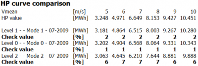
Above is an example of the HP/PN comparison. As seen in this example, the HP value at 5-6 m/s average wind speed matches exactly the power curve value. At 7 m/s, the HP value is 2% higher than the power curve value. At 9 m/s, it is 1% lower. If the deviation is more than +/-3% at a given wind speed, there should be concerns about the reality of the power curve. Note that the comparison is based on Rayleigh distributed wind (Weibull k=2) at standard air density (1.225 kg/m³). If turbines are running in noise-reduced mode, the HP check value tells the loss due to noise reduction. If the non-noise reduced mode has a check value of 1 and the noise reduced a value of 7, the noise reduced operation can be considered to cause a loss of around 6% (see example below).
Image: Example of HP check of power curves with noise reduction
From version 2.4, the HP values have been improved in that WTGs smaller than 150 kW are given reduced HP values based on experience. This means that:
- 50-149 kW: power is reduced to 90% for 50 kW, and, in a linear manner, reduced up to 100% for 150 kW.
- WTGs below 50 kW are reduced to 90%.
- 1 generator, pitch-regulated WTGs are reduced by 4% for mean wind speeds below 7 m/s.
With these corrections, the HP values will be more accurate for all WTG sizes.
From version 2.8, further improvements are made. There are now 5 check tables:
| Stall - 1 generator |
| Stall - 2 generator / variable |
| Pitch - 1 generator |
| Pitch - 2 generator (updated 2012) |
| Pitch - variable speed (new 2012) |
NOTE: When using the HP check it is VERY important that the field in the turbine catalogue called “Generator type” is correctly filled. From version 2.8, the 2-generator and variable speed means two different check tables. The “variable speed” version reflects more the 2000-12 generation of modern turbines with inverters to control the rotor speed, while the “2-generator” version is more relevant for older turbines.
The updates are based on comprehensive analyses by Per Nielsen, which was based on 23 reasonable, new power curves (2000-12 turbines). These are divided into Specific power classes, analysed part by part (foot, leg, shoulder and arm), and are the basis for establishment of “artificial power curves.” These are then the basis for calculation of the new “HP/PN-table values” included in most recent windPRO versions.
Image: Example of production vs wind speed for generic turbine
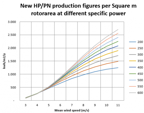
Above are the results of the analyses for the Pitch-variable speed, modern 2000-12 turbine. The parameter is specific power in W/m2 rotor area.
Test of Turbulence scaling
With the SCALER and time step PARK calculation, it is possible to establish the turbulence for each time step at each WTG position in hub height, see section 4.8.4. This can partly be used for turbulence correction of the power curve (only pitch regulated turbines) and partly to control the WDC in wake loss calculations.
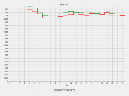
Image: The site mast with measurements, turbulence in 40 m and 50 m
Below the different variants of establishing the turbulence by SCALER calculations at a specific turbine position is tested.
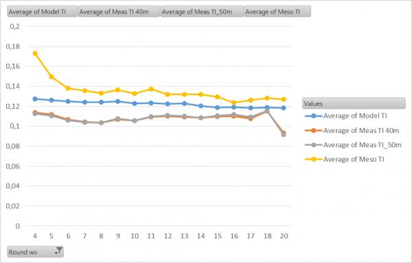
Image: Turbulence calculated at WTG-1 at 47 m hub height from different sources.
As seen the calculated turbulence based on 40 m as well as 50 m measurements is exact the same. This show the model perform the transformation correct based on different heights. The Model calculated TI is based on WAsP CFD model results. This comes out with slightly higher turbulence than measured. Finally, the TI taken from MESO data (EMDConWx) is shown. This is again some higher than the measurements. Overall not very large deviations.
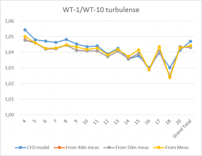
To test the calculation concept more comprehensive, the calculated TI at two different turbines is tested. At WT-10 the calculated (free) wind speed is 5% higher than at WT-1, therefore round 5% lower calculated TI are expected at WT-10.
Image: The ratio of TI at WT-1 and WT-10 with different calculation settings
As seen, the result comes out reasonable as expected. The calculated TI is 3-5% higher at WT-1 than at WT-10. In addition, it work similar based on all 4 described calculation settings.
It is hereby shown that the SCALER calculates the TI at different positions as expected. The accuracy of the calculated turbulence will although not be more precise than the data and models behind. In some terrain, the real turbulence might differ more than the model calculations show.
